Analysis of some newsgroups traffic
by Nasser M. Abbasi, Updated Nov 15, 2010
Data was imported from Google newsgroup. I could not obtain data for R so I do not have it here.
Plots are made for the following groups
In[2]:=
![]()
Out[2]//TableForm=
| group | URL |
| fortran | http://groups.google.com/group/comp.lang.fortran/about |
| matlab | http://groups.google.com/group/comp.soft-sys.matlab/about |
| mathematica | http://groups.google.com/group/comp.soft-sys.math.mathematica/about |
| maple | http://groups.google.com/group/comp.soft-sys.math.maple/about |
| scilab | http://groups.google.com/group/comp.soft-sys.math.scilab/about |
| symbolic | http://groups.google.com/group/sci.math.symbolic/about |
| ada | http://groups.google.com/group/comp.lang.ada/about |
| python | http://groups.google.com/group/comp.lang.python/about |
| lisp | http://groups.google.com/group/comp.lang.lisp/about |
| java | http://groups.google.com/group/comp.lang.java.programmer/about? |
| ruby | http://groups.google.com/group/comp.lang.ruby/about |
| cobol | http://groups.google.com/group/comp.lang.cobol/about |
| scheme | http://groups.google.com/group/comp.lang.scheme/about |
| sagesupport | http://groups.google.com/group/sage-support/about |
| sagedevel | http://groups.google.com/group/sage-devel/about |
| dsp | http://groups.google.com/group/comp.dsp/about? |
| num-analysis | http://groups.google.com/group/sci.math.num-analysis/about? |
| tex | http://groups.google.com/group/comp.text.tex/about? |
| math | http://groups.google.com/group/sci.math/about? |
| physics | http://groups.google.com/group/sci.physics/about? |
| maxima | http://www.math.utexas.edu/pipermail/maxima/ |
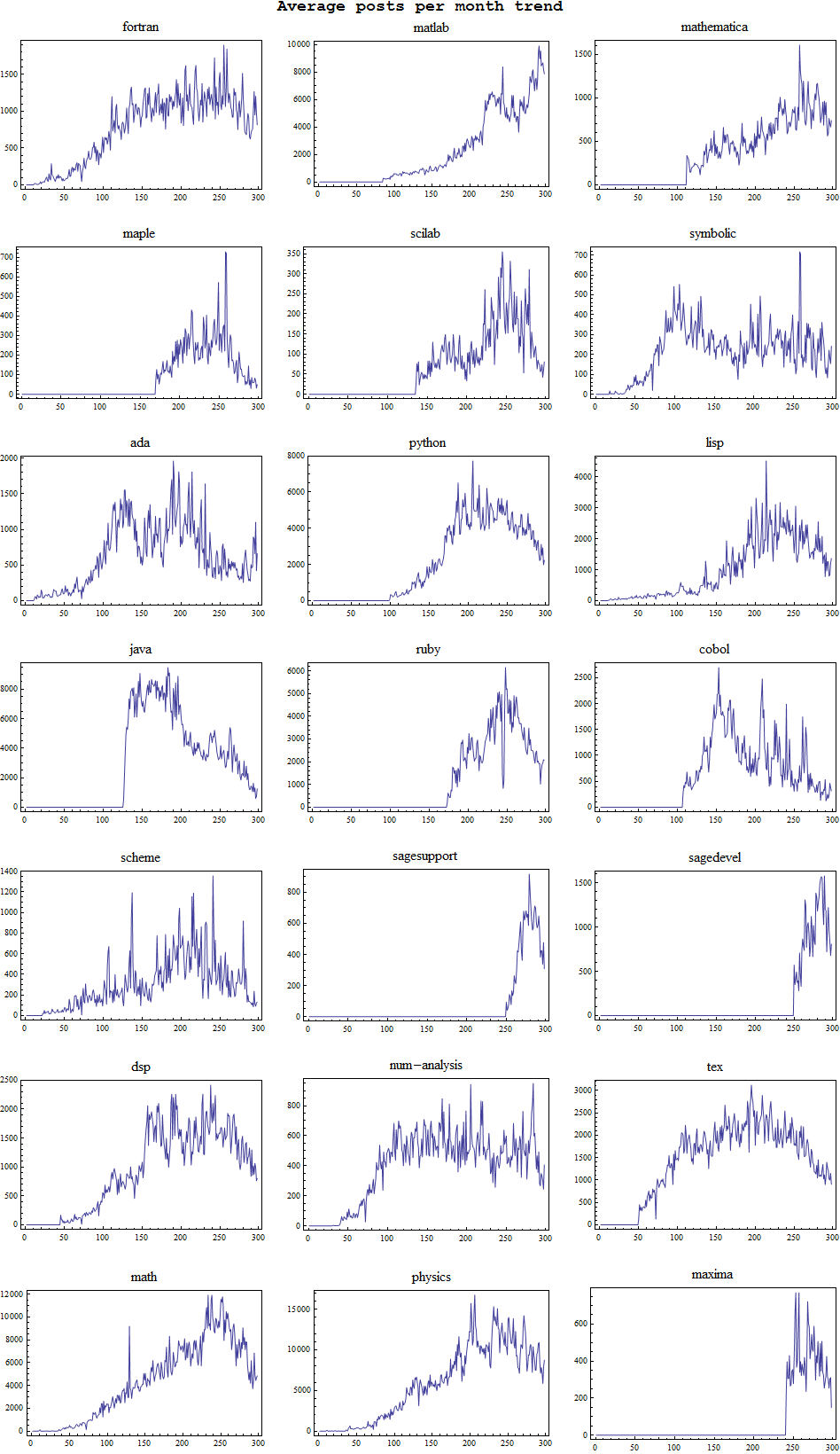
Show trends of each group on its own, y-axis is average number of posts per months, x-axis is month number starting the count from from 1988. Notice some groups are older than others.
In[36]:=

Out[36]=
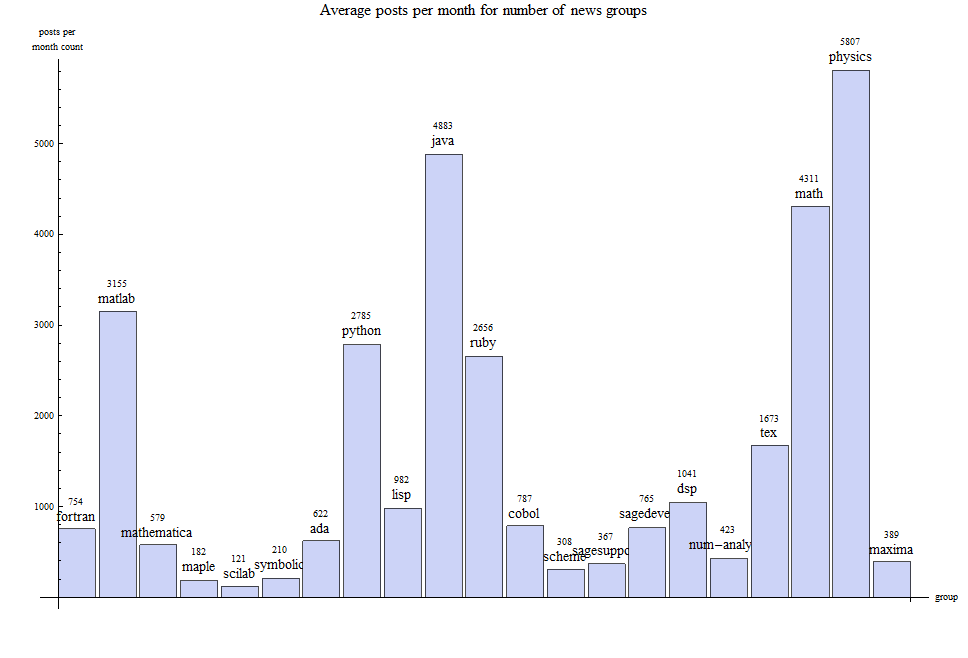
Make bar chart showing average posts per month for each group
In[35]:=

Out[35]=
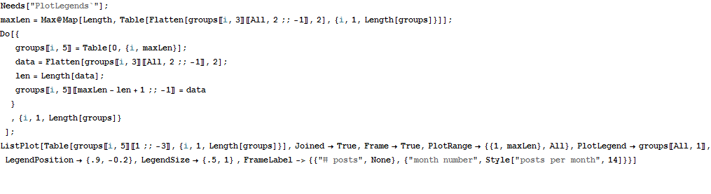
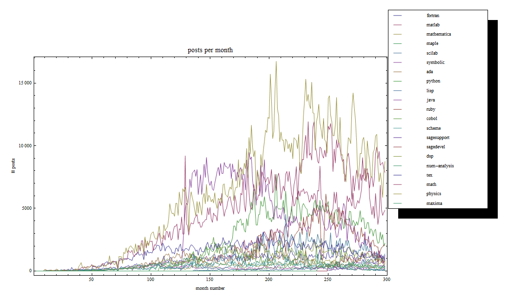
Show all traffic on one plot
In[31]:=
Out[34]=
How was the plots generated?
The data above was obtained for each system. Each entry in the list is the number of posts per month. Matlab started in 1993. Fortran in 1988, The Other systems did not start until later. A list plot was generated for each data, comparing systems against each others.
Sage has 2 groups. Support and Developer. It was suggested that only Support be used. Hence in the plots below, only Support is used. Average number of posts per month is also compared between all the systems. Data used is cut off at end of October 2010. Does not include November 2010.
Plots are all shown below.
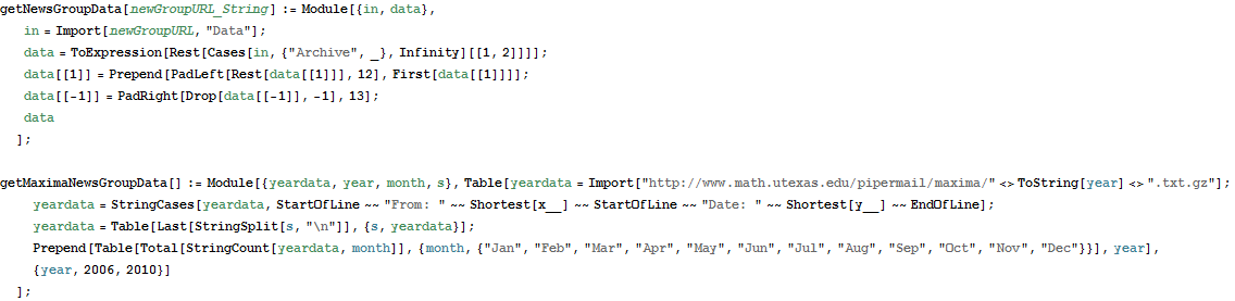
Function to download the data
Thanks goes to mark mcclure for providing thess functions on the newsgroup. Made downloading data much easier.
In[3]:=
Get all the data into arrays and process
In[23]:=